On this page
Quick answer
GTA’s visual identity works because it never changes its mood. The same sunset colors, bold type and Miami atmosphere show up in every trailer and poster, so one frame is enough to recognize it. Any brand can do the same with a small palette, one or two typefaces and clear rules.
Key takeaways
- Recognition comes from repetition, not from a clever logo.
- Pick a mood first, then the colors and type that express it.
- Write simple rules so everyone uses the identity the same way.
With GTA 6 launching today, its artwork is everywhere: pink and orange skies, neon signs, palm trees and bold, slightly retro type. Even the logo carries the mood: the same sunset gradient sits inside the big “VI”. You don’t need to read the name to know what it is. That is what a strong visual identity does.
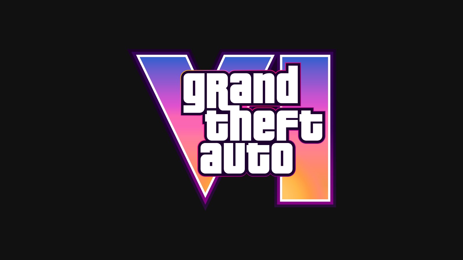
Grand Theft Auto VI and its logo are trademarks of Rockstar Games. Shown here for commentary only; EV Studio is not affiliated with Rockstar Games.
Here’s how it works, and how to build one for your own brand without a game studio budget.
1. Start with a mood, not a logo
Before the colors and fonts, GTA 6 has a feeling: hot, loud, a little dangerous, very Miami. Every design choice serves that feeling.
Write your mood down in three or four words before you design anything. “Calm, clean, trustworthy” leads to a very different brand than “bold, fast, playful”. Those words become the test for every later decision.
2. A small palette, used everywhere
GTA 6’s artwork leans on a narrow range: sunset pink, warm orange, deep purple and black. Because the range is small, it is easy to remember.
For your brand, pick:
- One main color that people will link to you.
- One accent for buttons and highlights.
- Two or three neutrals for backgrounds and text.
Then use the same colors on your website, social posts, packaging and slides. The repetition is what builds recognition.
3. Typography with character
Type does a lot of the mood work. Bold, condensed lettering feels loud and energetic; a clean sans serif feels calm and modern.
Choose one display typeface for headlines and one simple typeface for body text. Keep the sizes and weights consistent. Two fonts used well look more professional than five used at random.
4. A consistent image style
Every GTA 6 image shares the same lighting, color grading and framing. Even different scenes feel like one world.
You can do this with ordinary photos. Use the same filter or color grade, similar framing and similar backgrounds. If you use illustration, keep one style. Mixed styles make a brand feel like it was assembled from different places.
5. Rules, so the identity survives
Big brands keep their look consistent with brand guidelines. Yours can be one page:
- Your mood words.
- Your colors, with exact codes.
- Your fonts and when to use each.
- Two or three examples of good and bad usage.
Share it with anyone who makes something for your brand, including freelancers and your own team.
See it in a real template
We used the same approach in Heatwave, our free Framer template for gaming communities: one sunset palette, one loud display typeface, and the same neon mood on every page. It’s a good starting point if you want to see a strong visual identity in practice.
Building your own brand identity
A recognizable brand is not about having the most striking logo. It is about making the same choices again and again, until people know it’s you before they read your name.
Need a visual identity that people remember? Explore our branding service or start a project for a fixed quote within 24 hours.
Frequently asked questions
What is a visual identity?
It is the set of visual choices that make a brand recognizable: colors, typefaces, photo and illustration style, layout habits and the overall mood. A logo is only one part of it.
How many brand colors should a small business use?
Usually one main color, one accent and a few neutrals. Fewer colors used consistently are easier to recognize than a large palette used at random.
How long does it take to build a visual identity?
A focused brand identity for a startup or small business usually takes two to four weeks, including the logo, colors, type, a few key templates and simple usage rules.
Written by
Istiaq Ahmed
Istiaq is the founder of EV Studio, a product design and software engineering studio. As a Framer Expert he publishes free Framer templates used by creators worldwide, and designs and builds websites, apps and AI products for clients.
About EV Studio